AI is changing how software gets built. You write a prompt, the app appears, and for a few minutes it feels like magic.
But one thing AI has not changed is basic human behavior: people skim. They do not want to read through a long plan every time an agent is about to change their app.
That matters because most Plan Modes today are still text-heavy. They ask the user to review a checklist before the agent writes code. Useful, but limited.
“I’ll scaffold the app shell, add Supabase, create ideas and votes tables, build a submit flow, add a roadmap page, create admin moderation, and wire up the navbar.”
That sounds fine, until you realize one prompt can touch routing, state, database, auth, permissions, components, and files all at once.
The more powerful these agents get, the more important that review step becomes. But the format is still wrong: the prompt is too blunt, the plan is too linear, and the app is not.
So I started playing with a simple idea: what if Plan Mode was visual?
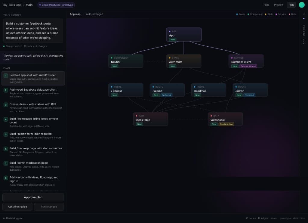
In this prototype, the user asks the agent to build a customer feedback portal where users can submit feature ideas, upvote other ideas, and see a public roadmap.
Instead of only reading a list of steps, you can see the shape of the app: routes like /ideas, /submit, /roadmap, and /admin; components like the navbar; state like auth; services like the database client; and data models like the ideas table and votes table.
The map gives you the app at a glance. It also shows which pieces are new, protected, external, or need review.
Then, instead of rewriting a giant prompt, you can click directly on the thing you want to understand or steer.
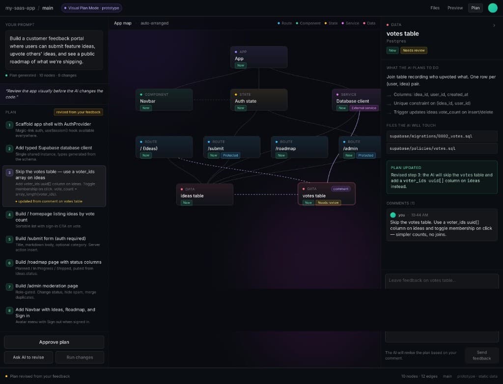
This is where the review loop gets more useful.
Click votes table and you can see the AI’s assumption: create a join table recording who upvoted what.
That might be the right architecture. Or it might be overbuilt for this version. Maybe for v1, you do not need a full join table. Maybe a simple voter_ids array on the ideas table is enough.
So instead of writing a long follow-up prompt, you comment directly on that part of the plan:
“Skip the votes table. Use a voter_ids array column on ideas and toggle membership on click.”
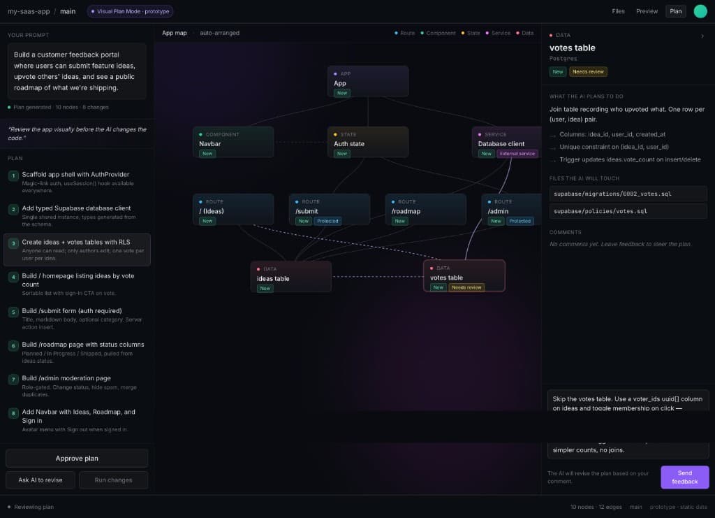
That is the interesting part. The map becomes an interface for steering the agent.
You can say: “This route should be protected,” “Don’t create a new table,” “Keep this out of v1,” “Use the existing component,” or “This should happen server-side.”
That is a higher-bandwidth review loop.
The goal is not to make AI coding more technical. It is to make the system state visible enough that the user can make better decisions before the agent runs.
For tools like Bolt, Lovable, Replit, Cursor, and others, I think this could become a natural evolution of Plan Mode:
from text checklist → visual app map → editable execution plan.
The best version is not “architecture diagrams for vibe coding.” The best version is:
Show me what the AI is about to change before it changes it.
That’s where trust starts. And for vibe-coded apps to become real products, trust might be the next big UX layer.